A Color Study Leading Towards Materialism
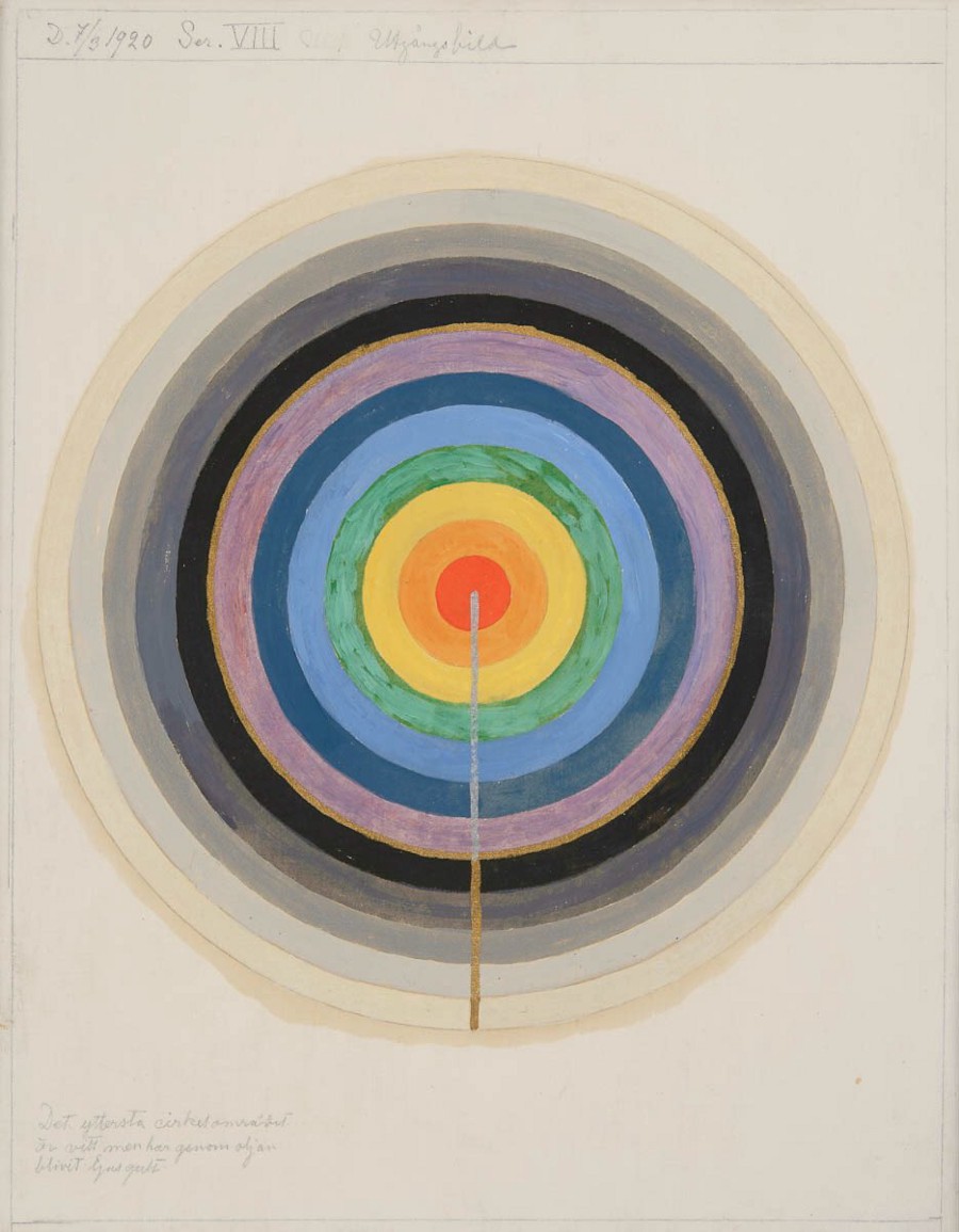
Hilma af Klint “Series VIII. Picture of the Starting Point”, 1920
1. The Poverty of Imagination
For a long time, numerous civilizations have perceived color by way of specific material legacies; cotton is not white, but the color of cotton. When seeing red, we also think of blood, iron ore and red wine. Until Newton’s light beam traveled through a prism, color was perceived as an autonomous substance, something existing independently of other objects.
Based on Newton’s theory of optics[1], modern color theory[2] was invented in 1898 by Albert H. Munsell (1858-1918), resulting in the color identification system that we are familiar with today, one that sorts colors based on the properties of hue, chroma and value. This system has not only withstood major structural changes, but also deeply influenced the Pantone color matching system, widely used in the fields of textiles, architecture, and plastics manufacturing, as well as the color selection interface in graphics software.
If seeing colors involves a politics of perception, then our utter reliance on this one identification system represents a collective failure of imagination. In order to quantify and circulate, such a system assumes that color is a static visual entity, existing in a sluggish tradition of seeing. This system of perceptual monopoly has not only impoverished the way we see, but thrown the manufacturing of colors into a mechanistic cycle, robbing us of chances to recognize difference. From a seven-colored rainbow, to Munsell’s 320 reference colors, to the millions of colors available in Photoshop, our color wheels have become increasingly convenient and accessible; the distinctions in our color gamuts have become precise, as if meticulously enumerating all possibilities. As a painter, however, I am always thinking about the types of experience that such a system omits.
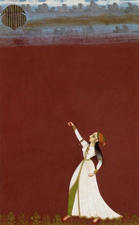
Anonymous “Flying a Kite “, Mineralpigment on paper, 1740
2. The Material History of the Earth
The carbon inside the nuclei of human cells originated from the atmosphere; the salt inside our sweat and the iron in our blood comes from remnants of iron ore eroded by the wind; during the Cretaceous period, expansion of the earth’s crust resulted in the large amounts of chalk being deposited across the planet, chalk which exists, today, in our teeth. For the majority of known history, the material history of the earth we stand on not only produced all planetary life, but resulted in the history of color: the black of carbon, the red of iron, the white of chalk—the colors we see are those the earth has allowed us to see. But now, when we speak of color, we no longer imagine the appearance of the earth, the landscape, and substances; color appears instead as abstract fragments on a screen or serial numbers on a shelf.
Gabriel Garcia Marquez’s famous Hundred Years of Solitude begins, “The world was so recent that many things lacked names, and in order to indicate them it was necessary to point.” [3]
From the standpoint of the earth’s evolution, a science fiction novel about colors might unfold this way: due to greenhouse gases and air pollution, the period from the 1960s to the 1990s, the incident solar radiation on the surface of the earth has already diminished by 4%. As a result of this “global dimming,” the sun’s rays during the day become increasingly lackluster on earth, but the standard wattage of lights in museums and galleries across the world has tended to increase yearly; in another century, indoor spaces will be brighter than outdoor ones. Or perhaps, annual increases in sea temperature and the decreasing oxygen content of seawater will one day entirely change the color of the sea. Will this new, oxygen-deficient sea be red, black or yellow? Other than imagining these future experiences, we might look back at the material history of the planet and discover the lives of colors that have gone extinct. The past also contains entirely new perceptions, based in reality yet surpassing such reality.
When the Great Pyramid of Giza had just been built, its outer layer was made of burnished, white limestone bricks; this kind of limestone is one of the earth’s purest “biorock,” its structure comprised almost entirely of circular fossils, each a single-celled organism large enough to be visible to the naked eye. In the early Cambrian, the earth’s temperature was extremely high, and the surface of the Tethys Ocean began to rise, and consequently, warm seawater began to spread to Scandinavia in the West, and to Africa in the East, covering the entirety of this area. Great numbers of Foraminifera grew and died in this enormous stretch of water, and sank to the bottom of the sea, the calcium carbonate in their bodies forming a thick “rug.”
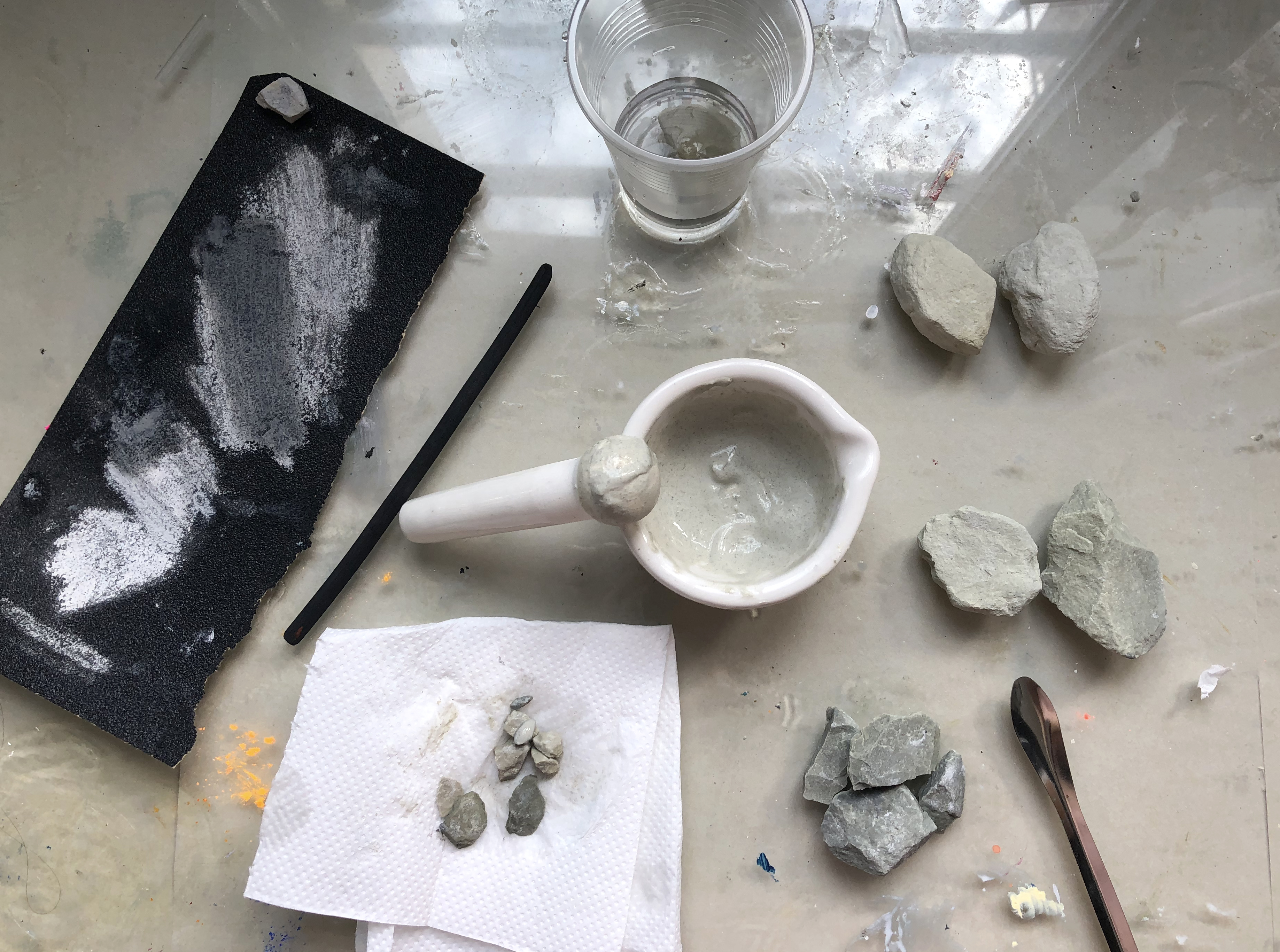
Grinding the green sand stone collected from Hunan province, China.
In 2020 I traveled through Hubei and Jiangxi and saw numerous instances of the stone that had been formed in such a manner. It was used as building material for the city’s infrastructure; you could see such hundred-million year old fossils embedded in the floor tiles and stone steps. This very limestone, sturdy and reliable, built the pyramids, Gansu’s Mt. Maiji Caves, and Trump Tower on New York’s Fifth Avenue. Its main component, lime—calcium carbonate—is also the main ingredient in gesso, integral to the thousand-year material history of oil painting. This relatively warm, absorptive white not only played a part in the thousands of years of human architectural history, but was also the face of oil painting for much of its history, present through the refinements of the image that followed its invention.
Of course, not all colors were lucky enough to endure as a stable physical structure and geologically abundant heritage.
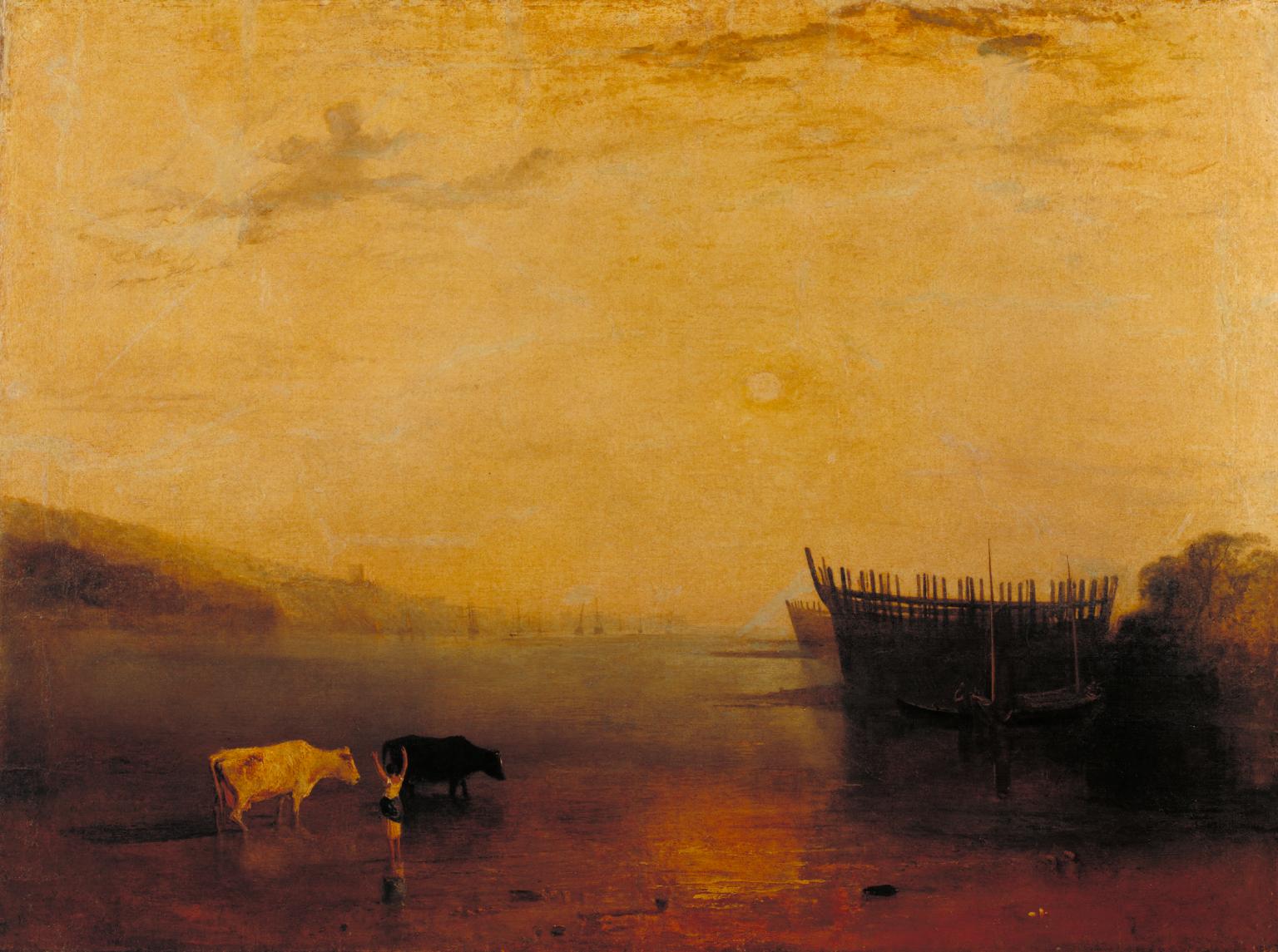
Joseph Mallord WilliamTurner, Teignmouth,1812,Oil on canvas,90 x 120.5cm
Indian yellow entered Europe in the 17th century; even diluted in oil or tempera, it maintained a full-bodied texture and ability to render color faithfully[4]. Indian yellow and Gamboge, imported to Britain by the East India Company, were products of imperialism and maritime trade, but Indian yellow’s transparency and plasticity were greater than those of Gamboge. In J.M.W. Turner’s watercolors and oils, we can find abstract English skies, painted with large swathes of Indian yellow, pure and saturated to this day—fantastic colors, emitting a phosphorescent glow. Yet the strong odor of this pigment is just as remarkable as its visual effects; a ball of pigment has a mustard-yellow shell, like a cheese rind. After cutting this open, the pungent tangerine yellow powder gives off the acrid smell of ammonia[5]. In 1883, an Indian civil servant revealed that this pigment was produced in the village pasture whose herders only fed cattle mango leaves and water, and harvested their thick urine, putting it through repeated boiling and filtration, subsequently roasting balls of it into the finished product[6]. However, this color quickly disappeared from India and England. Whether for reasons of animal protection, ecology or safety, a law was passed in 1908 forbidding the production of Indian yellow. After 1920, there were no more recorded instances of the pigment being sold in markets. The brief history of Indian yellow shows that not only lost techniques and material scarcity, but changes in legislation, can cause a color to disappear.
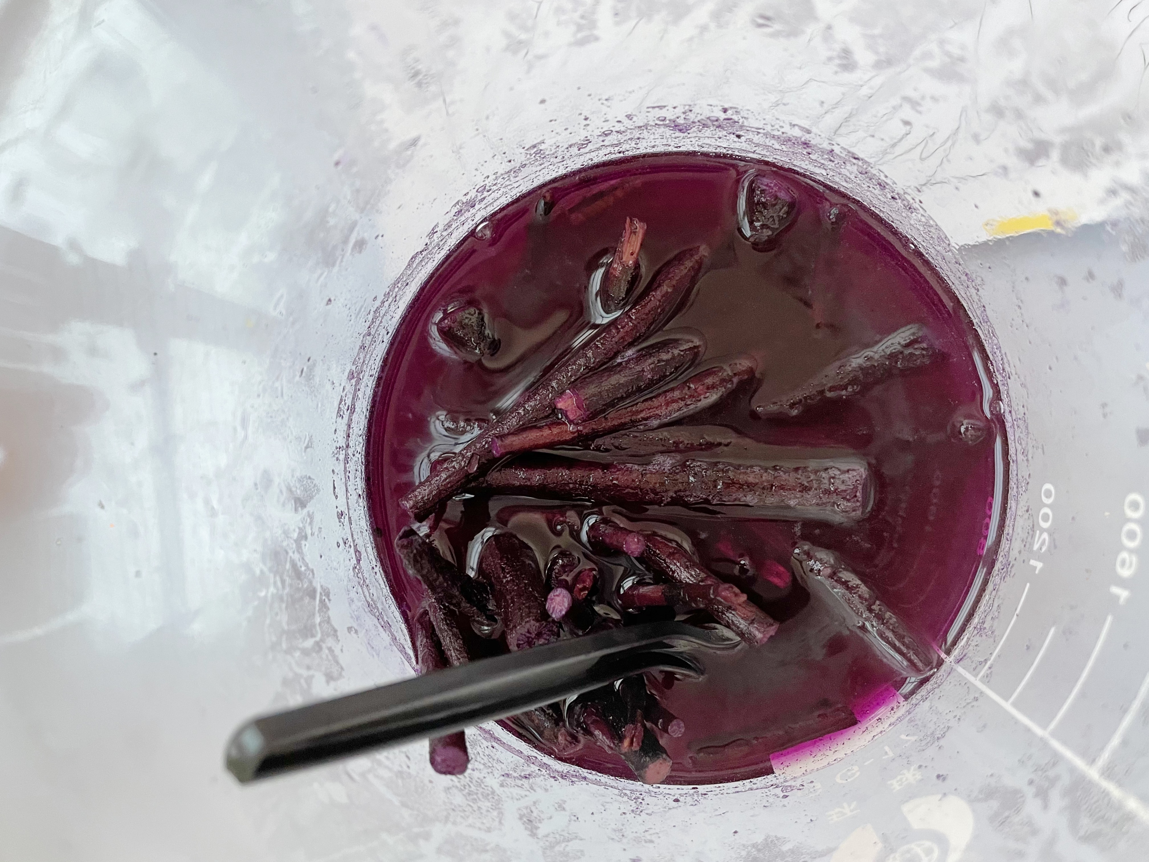 Extracting color from the root of Sinkiang Arnebia, collected in shanghai, china
However, due to differences in geology, in East Asia, the same color was developed and used in entirely different ways. Approximately three hundred years before the European Renaissance, Wang Ximeng painted A Thousand Miles of Mountains and Rivers. This kind of blue-and-green landscape painting, executed in the gongbi style, with heavy, mineral paint, reached its zenith in the Northern Song period. Wang’s paint, which the naked eye could not differentiate from the same, European color, was ground from azurite. Unlike lapis lazuli, there are azurite deposits in China’s Hubei, Yunan and Guangdong provinces; this carbonate salt usually occurs alongside malachite (stone green or peacock green). The hardness, crystal structure, and wavelength is similar in both minerals, which often appear together in Heavy Color Paintings (重彩畫).
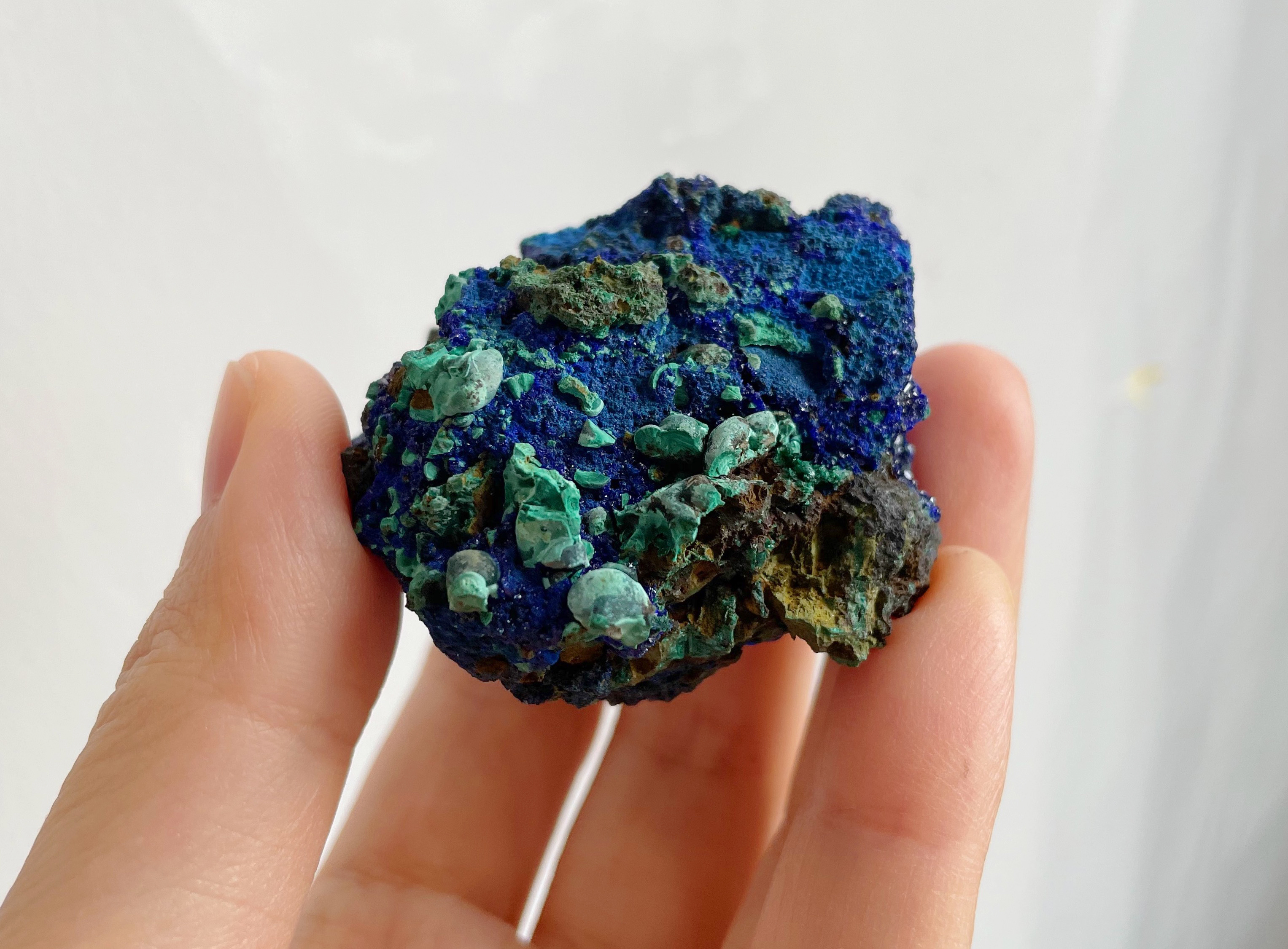
Two types of copper minerals Azurite and Malachite co-occur in one form
Aside from the minerals already contained inside the earth, there are many colors created from raw, geologic material, with the aid of developments in processing technology and chemistry. The cobalt blue we know today, for example, has been used for thousands of years on porcelain and jewels, but the first time the color was produced according to modern purity standards was in the beginning of the 19th century. This alumina-based pigment reaches a stable state only after being heated to 1200 degrees Celsius. When cobalt blue was produced in Europe, it was understood as a substitute for the exorbitantly priced ultramarine and French ultramarine, but today, when buying paint at art supply stores, we see that cobalt blue and ultramarine are entirely different colors. Anyone can detect the warm tones in cobalt blue and the violet in ultramarine. Colors are sometimes like scents: it is not that we cannot identify their differences, but that our vocabularies are sometimes too limited to express perceptive variations. However, when there are more names for things, these differences become instantly apparent.
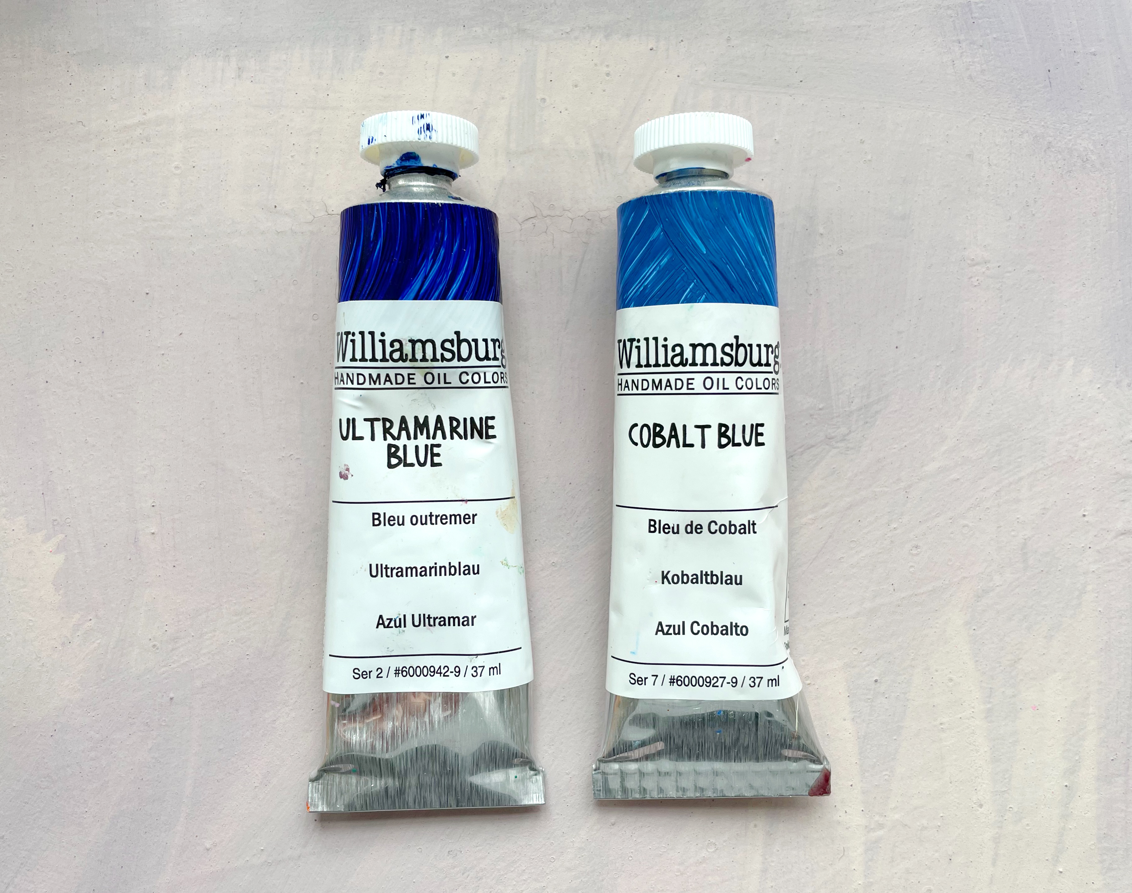
Ultramarine blue (left) and Cobalt blue (right) produced by oil colour brand Williamsburg
3. Language is the Currency of Perception
The Odyssey, which Homer wrote in 800 BC, famously includes numerous, strange descriptions of color[7]. The bard uses “purple” to describe blood, the tides, storm clouds and rainbows—yet not once does his epic poem mention “blue” or “orange.” In a monograph that analyzes the Odyssey’s use of colors, William Ewart Gladstone highlights five points that prove Homer’s descriptions of color are not arbitrary or random; the first point appears in an annotation[8]: ‘The use of the same word to denote not only different hues or tints of the same colour, but colours which, according to us, are essentially different.’ This annotation shows the author’s understanding of the subjective quality of color perception; that how we watch, and how we identify, color, is not only relative, but fluid. Yet the premise seems lost to us, so many centuries later.
Through the lens of semantics, the world arrives before our eyes, yet this world often carries with lingering, spectral traces, arriving plurally. About 70% of humans speak more than one language, but when we speak of multilingualism, we refer not only to knowing the rules and grammar of multiple languages, but the sense of the multilingual structure of individual languages. Without contributions from French and German, modern English would cease to be modern; in addition, its numerous etymological roots from Latin and the many languages of Indian origin all contribute to its identity. In 2016, on the eve of Brexit, I was buying materials from a woodworking factory. The technician, who by that point was very familiar with me, cut wood while complaining to me about the new wave of immigrants moving to his neighborhood, how the English they spoke wasn’t real English. I only then realized that the English I spoke had never been “real English” either, but was instead like the Odyssey’s attempt to describe colors: jarring and impossible to ignore.
In Minor Feelings, Korean-American poet Kathy Park Hong writes [9], ‘Ever since I started writing, I was not just interested in telling my story but also in finding a form—a way of speech—that decentered whiteness.[10]’ She writes about how growing up, her accent, grammar mistakes, ineffective rhetoric and off-kilter humor—this “broken English”—formed an important part of her identity and heritage. Only by misusing English, queering it, othering it, can we reveal its imperialist and colonialist traces.
Similarly, inside and outside of art history, how much of our visual experience is framed by semantics? Our ways of identifying contemporary color schemes are still tied inextricably to a Western-centric historical process. Color identification systems are still in need of liberation.
4. A Pun on Light and Color
Four names for the colors of ancient Japanese dyes are still in use today: red, white, blue-green, and black. Yet initially, these names did not refer just to colors, but to four different states of light. Red corresponds to “bright,” white to “clear,” blue-green to “obscure,” black to “dark.” Sunlight also runs this gamut from red to black in the course of a day. Here, color identification is predicated on sufficient light, rather than hue, and carries with it a strong, temporal message.
Japanese children differ from those of other cultures in that they always describe the sun as red. Contrary to what we might think, this image can be traced back to a small detail in the evolution of Japanese language, one that appeared earlier than the rising sun flag. The words “red” and “bright” both use the same word, aka, whose adjectival version is akashi. In the Yamato Monogatari, published in 951 BC, we can find the following lines of poetry: “The moon is bright (red) as bright (red) can be.” Here, the word “red” does not convey hue, but a perception of light; when an object is extremely bright, our strong, strong sensory experience of it is similar to perceiving fire. These puns that fold the “visual” in with “language” can be found in numerous places in contemporaneous texts, such as the Man'yōshūor[11] and Shūi Wakashū [12].
5. Who Deserves a Name?
Published in 1969, Bernt Berlin and Paul Kay’s Basic Color Terms: Their Universality and Evolution [13], sampled 2600 people who speak 110 languages without writing, discovering that 83% of cases demonstrate the same hierarchy of words about color. In other words, across different languages, the order of colors for which people develop names is strikingly similar. If a language has a vocabulary containing six words that denote color, for example, then humans seem to always first see bright and dark (white and black), then red, green or yellow, and finally blue. Of course, some linguistic systems contain more or fewer words for color than others; others feature very few words dedicated exclusively to naming color, but which use many other words for everyday objects to talk about their corresponding colors, such as the Yele Language of Papua New Guinea, which uses “nj:ii wulu,” the word for “tree sap,” to refer to orange, or “mtyemtye,” the word for parrot, to talk about red [14]. In Taiwanese, words referring exclusively to colors only cover a handful of hues, but words for color borrowed from other objects number in the hundreds, such as “muntjac,” “Shoulang yam,” or “pig’s liver.” These colors span the spectrum by minute degrees, reflecting culture, diet and climate.
6. The Problem of Qing
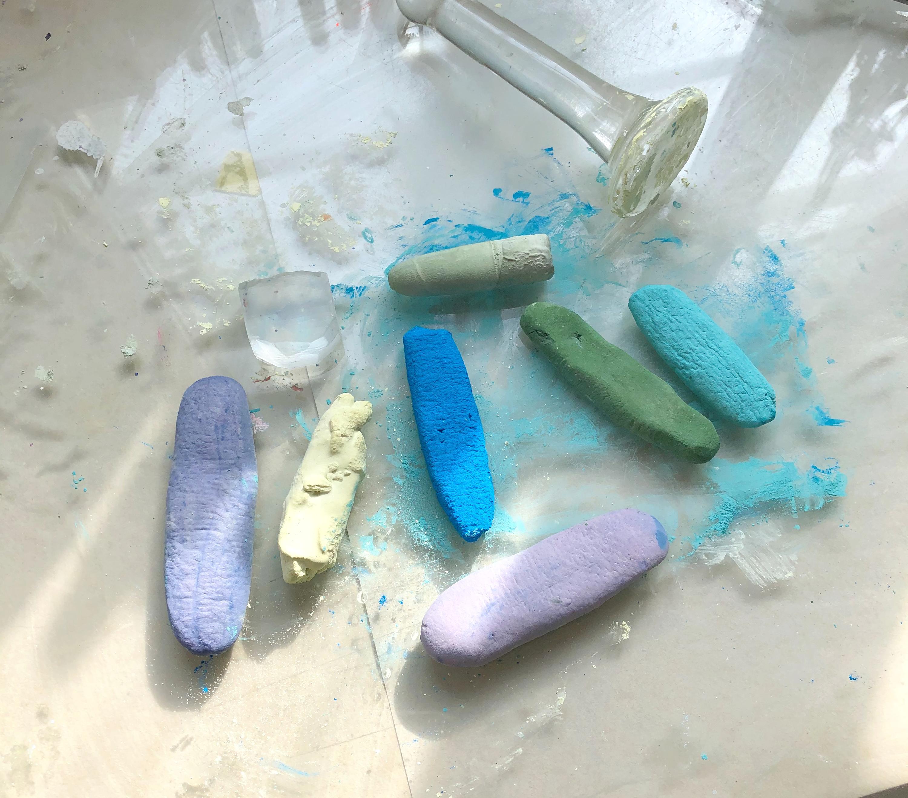
Pastel hand-made with earth, mineral, coconuts oil and soap base
The Chinese color, qing—blue-green—has always been in a state of flux; it refers both to the green of grass, the blue of skies, and sometimes even the black of hair.
In a renowned essay about qing, Xun Zi (313-238 BC) writes: “qing derives from indigo, yet is more blue-green than indigo.” The first qing refers to the color, while the word for indigo (the plant), lan, is also the word for “blue.” The statement demonstrates qing’s journey from material embodiment to dye/pigment production: after being processed, the blue-green of Chinese indigo (Persicaria tinctoria) can become color bluer than the plant.
In Shuowen Jiezi (說文解字), the Eastern Han character dictionary, the author, Xu Shen (58-147), writes: blue-green, a color from the east. Wood begets fire, thus the word, 青( qing) , is comprised of characters for 生(beget) and 丹(red). Here, “east” refers to the philosophy of the five phases, in which the cardinal direction, east, corresponds to the element of wood, once again linking qingwith woody plants, indirectly revealing the material connotations of the color.
Qing’s relationship to grass began to change in the Tang Dynasty. Li Zhaodao’s painting, Ming Huang’s Journey to Shu, marks the beginning of the blue-and-green landscape tradition. Not only are the blues and greens of the painting made of thick, rough mineral granules, but the use of both colors demonstrates a strong sensitivity to light. Li Zhaodao meticulously uses blue azurite pigment on the shaded sides of mountains, and the green malachite pigment on the sunlit parts. As mentioned before, azurite and malachite, though two, individual monoclinic crystals, are often found together, in the form of azurite-malachite, like the bright and dark sides of the one mountain.
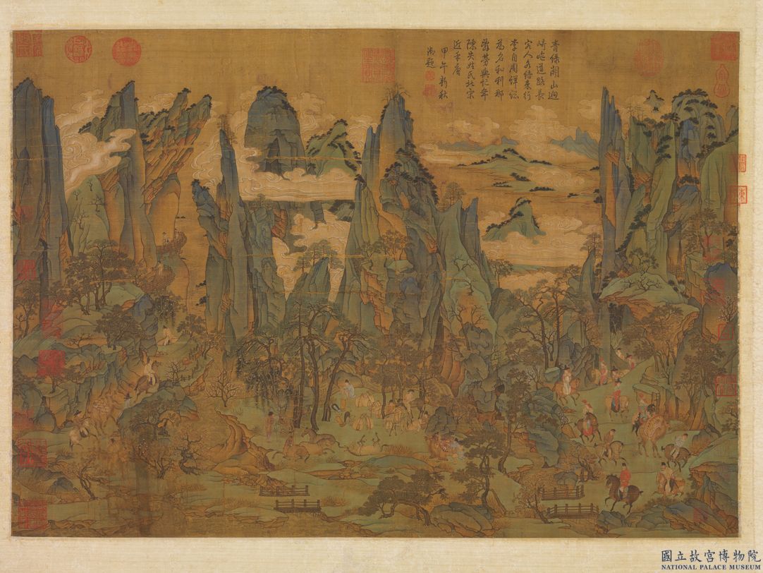
Li Zhaodao Ming Huang’s Journey to Shu, Tang Dynasty, ink and colors on silk, 55.9x81cm
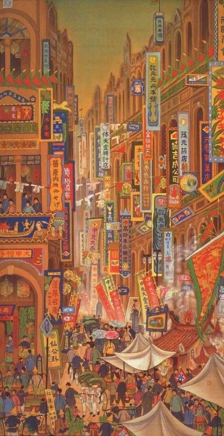
The crux of the issue of how to differentiate qing has less to do with hue as we normally understand it, but rather its saturation, or chroma, and its brightness. Qingcan be both blue and green in hue, but it must be highly saturated, and low in brightness [15]. As mentioned in Shuowen Jiezi, qingis a “raw” color, one that, if its brightness is low enough, becomes indistinguishable from black. The variation in hue of green, lü, is less than that of qing, but refers more often to a warm color, low in saturation, high in brightness. It is also difficult to extricate the word from associations of weakness and frailty, in distinction to the rawness of qing. The next time we look at Ming Huang’s Journey to Shuor Wang Bumeng’s A Thousand Miles of Mountains and Rivers (rumored to have been painted between years 1096-1119), qing and green are no longer two types of colors to be layered and applied, like adornment on a bone; they are the skeleton, consciously refracting light and dividing space, showing how language and visual experience move in lockstep.
Original table by Shigeru Shimizu. Recharted by Su Yu-Xin
7. Impressionism Seen from the Subtropics
On one, hot August, I finally travelled to Paris from London for the first time. The Paris train station was built in 1970, already a century after Impressionism, but its style was fairly similar, still, to Monet’s The Saint-Lazare Station. The Eurostar train that I was catching, however, no longer blew steam, its streamlined compartments half-open on the platform. Paris’s summer moisture, the heat of the train’s machinery, and the outdoor light all assaulted my face when I disembarked. My eyes grew dizzy, adjusting for a moment to the world outside of the train compartment. This was the world on the other side of the English Channel.

Claude Monet, The Saint-Lazare Station, 1877,Oil on canvas,75 x 104 cm
Monet painted seven paintings of train stations and their environs. In this particular work, part of the Musée d'Orsay’s collection, the shaded area inside the station is an ochre approaching purple, while the sky outside the station is pink-blue. Whorls of steam, pink and various shades of gray, evaporate into the air; in the distance, the new apartments that Haussmann renovated during Napoleon III’s reign sparkle with golden light. This confectionary view was painted with thin brushes, dabbed with lead white and chrome yellow paint—now banned from production because of their toxicity.
Impressionism revolutionized European painting. Intoxicated with studying nature, light, and color, it was also the first movement to visually represent French industrialization and the modernization of the landscape. The loose, crisscrossing blue-gray brushstrokes of Monet’s Impression Sunrises soften the boundary between horizon and sea, and the artist’s upward-slanted strokes capture the vaporous motion of the sky; such vapors are not the mists of sunrise, but are more likely particulates polluting the air.[16]
It was then in Paris that I, who grew up in the western side of the Pacific, understood how latitude, the angle of the sun’s rays, the way the seawater enveloped the land, and developments in urban architectural design and technology had produced the scenery before my eyes.
Because of salt and oxygen content, and the quality of its ocean floor, the Atlantic is low in temperature, its color much deeper than the Pacific. Sunlight can penetrate all the way to the ocean floor [all the way down to the bottom?], refracting a deep blue. Aside from this, Europe’s high latitude means that the sun’s rays slant down onto the continent’s surface, and that the sun needs a longer time to rise and set. In the shadows it casts, people can more easily see minute changes in color. In contrast, sunlight comes down directly onto the Pacific Rim, which is located closer to the equator, and in such areas, space is flatter, and artists are more inclined to see color before they see space, or to represent the relationship between space and objects with hues.
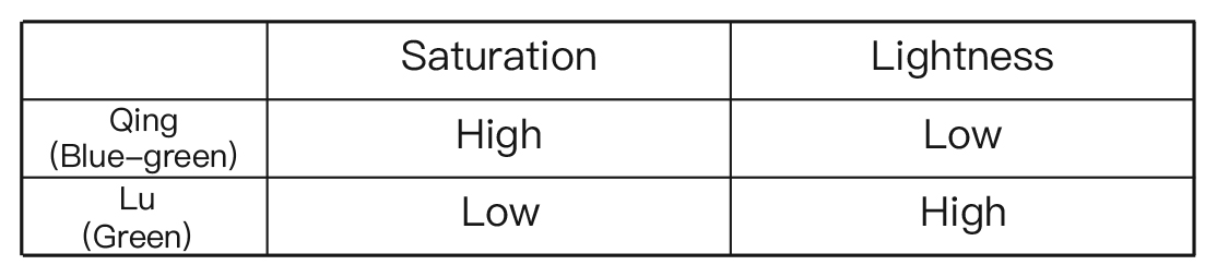
KuoHsueh Hu(1908–2012)Festival on South Street,1930 ,Mineral pigment on silk, 188 x 94.5 cm

Utagawa Kunisada,A Modern-day Match-up with the Four Estates, 1957,Woodcut
Ukiyo-e, popularized in the 18th century, is renowned for its highly stylized visual quality, its employment of primary colors and the near absence of shadows in its depictions. Ukiyo-e is often seen as a distant, foreign inspiration for Impressionism—but this interpretation, empty of geography and political history, ignores the ways that Ukiyo-e engages with color and space, apart from concerns of printing technology. Its use of color does not merely celebrate form, but also marks our geographical location, and shows that why I see what I see is because I am here, not elsewhere.
8. Humidity
Another long-neglected element of seeing is humidity[17].
One of the Phillipine islands, Mindoro (latitude 12° 53'), has an annual humidity of over 80%, and an average temperature of about 30 degrees Celsius. This is an island that is warm and humid all year round. In the southern part of the island, Hanuno’o, an Austronesian language is spoken, one with four basic names for color: dark, light, red and green. Affixes are attached to these, not just to denote familiar qualities like brightness, but also non-visual physical perceptions, like wetness and dryness. This kind of color system is impossible to translate or convert into any current system of color identification, yet seems somehow closer to the lived experience of painters and paint workers.
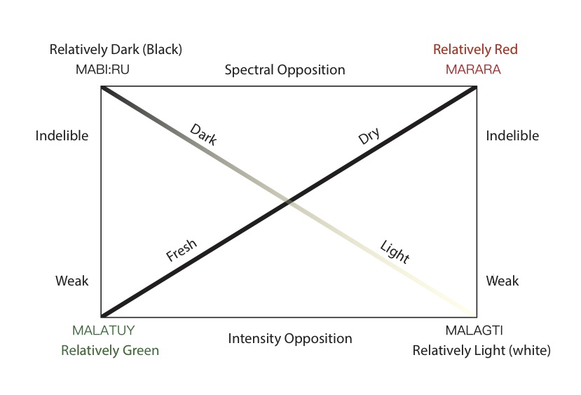
Original diagram by Umberto Eco,first appeared in Marshall Blonsky’s On Signs, 1985, page170.
Humidity’s effect on vision is not only limited to islands and countries near the equator, but can be seen anywhere. Light’s dispersal through aerosols is influenced to a large degree by relative humidity; when the hygroscopic particles in the air absorb concentrated water vapor, there is a resulting decrease in visibility. To see this demonstrated, we need only to look at how on a humid, windless day, molecules gather stably, creating mist, affecting viewers’ sight.
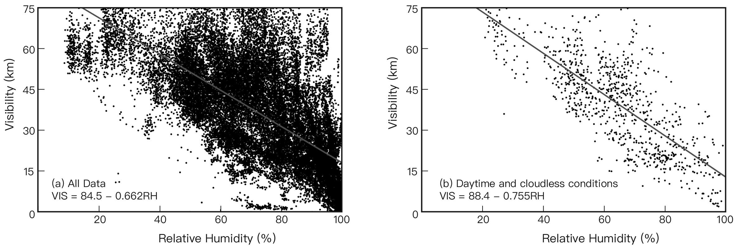
Visibility versus relative humidity for (a) all day and all-weather conditions; and for (b) daytime and cloudless conditions. The lines and equations obtained by linear regression are also displayed in red.[18] Diagram re-charted and translated by Su Yu-Xin

Lucas Arruda,Sem título (untitled), 2017,Oil on canvas,30.5 x 30.5 cm
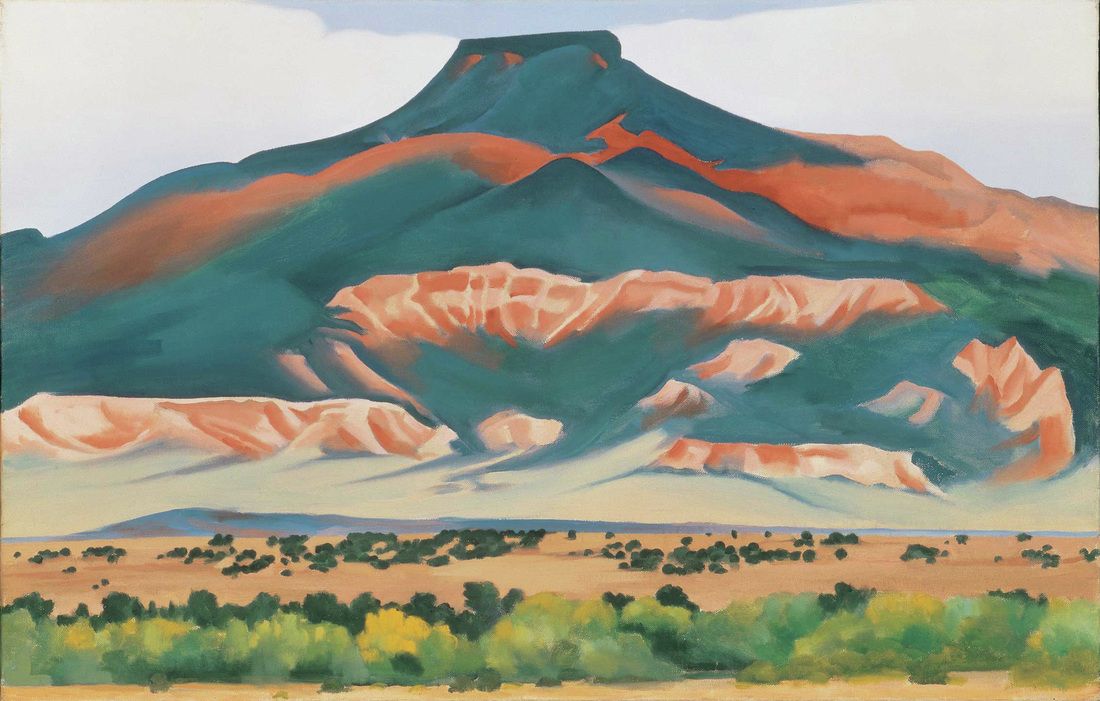 Georgia O'Keeffe, “My Front Yard, Summer,1941,Oil on canvas,20 x 30 inches
I walked parallel to Los Angeles, east to Arizona City, entered a new timezone, and arrived at New Mexico. This horizontal stretch of land, located at about 34 degrees latitude, is filled with deserts and sandstone landscapes of various colors. The dry air and the vastness of the land allows people there to see very, very far—and not just far, but as though there is no depth of field, as if you could see the very curvature of the earth. At the very limit of your vision, you can make out the smallest details up the side of cliffs. The scenery here seemed utterly new to me, rich and crisp.
These arid, varied geological sights offered myriad possibilities for perceiving light. Of course, Americans’ desire for “westward exploration” reached new heights after the Civil War, aided by the lure of silver and gold deposits. Many artists moved to this area as well. From the scenes of New Mexico painted by William Robinson Leigh (1866-1955) and Georgia O’Keeffe (1887-1986), perspective, shape, luminescence and the soil’s color all reveal new information—they are scenery as well as coordinates.
9. Color Study as Politics of Geography
Color study has always been interdisciplinary. It used the seemingly objective laws of optics, physics, and chemistry. But now, what it needs is other forms of knowledge that bring our attention to the outside world, to the other—such as geology, linguistics, comparative literature, even meteorology—and hypotheses which treat individual experience as though it were collective.
Where does sight travel and language drift? To arrive somewhere with more space, it is necessary for us not only to reexamine art history, or even History with a capital H, but to practice our ability to perceive difference in our daily observations, and to identify the course that objects have taken through the course of history. This kind of color study, based on a politics of geography, would eschew using just one perspective to regulate our imaginative process. Of course, many acts of creation can begin with a single location, one which can serve as a prism for seeing greater possibilities in a past reality. Or, as I think in my studio, perhaps we can use our perspectives, here and now, to generate plural truths in the future, ones we might have otherwise neglected.
Written from my studio in the post-pandemic Shanghai, 2020